Almazeem
Diving into the Project
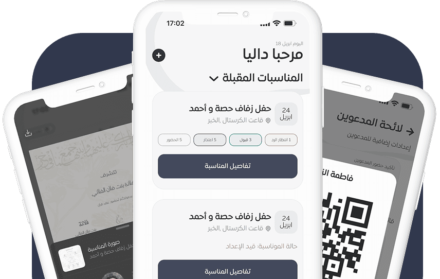
With the AL Mazeem website already live, the goal was to expand the experience into a mobile app that felt personal, accessible, and intuitive. I joined the team as the sole product designer, owning the process of translating the platform's core functions into mobile-first experiences. This involved rethinking flows, simplifying decisions, and designing for different user roles while keeping the app cohesive and aligned with the brand.
Design Process
The process started with defining core goals and mapping user flows based on the existing web platform. I sketched wireframes to test ideas quickly, then moved to high-fidelity designs. Regular feedback from the client helped align the app with both user needs and business goals.

To create a better product with strong UX and UI, I adhered to the following design principles:
Empathize
Identified user needs and pain points through both qualitative meetings and quantitative data analysis to understand the problem space.
Define
Synthesized research findings to frame the core problem, define personas, and map the user journey for clearer direction.
Ideate
Explored creative solutions through ideation techniques like brainwriting, user stories, information architecture, and flowcharts.
Design
Developed wireframes, style guides, and high-fidelity UI screens with a focus on accessibility, usability, and consistency.
Gather. Create.
Enjoy

Fonts
Color
Typography
I chose Expo Arabic for the interface to ensure a clean, modern, and legible experience for Arabic users. Its geometric structure and balanced letterforms provide clarity and visual consistency, aligning with the app’s minimalist aesthetic and enhancing overall usability.

Weight: Regular, Medium, Semibold, Bold
10,12,16,20px

Grid System

Grids create balance. Design creates connection. Let’s dive into the experience.
Before diving into wireframes or digital tools, I began by sketching out rough ideas to explore the structure, flow, and potential interactions of the app. These early drawings weren’t about perfection, but about clarity. They helped me quickly iterate, test ideas, and visualize how users might navigate the experience. What you see here is where form began to take shape — a raw but essential part of the creative journey.
Sketch

Effortless navigation, intuitive icons.Scan now with ease✨

Visual Design
120+ Screens